How to build an accessible button

TL;DR [too long; didn't read] 🤯
- Use native HTML `<button>` for actions to ensure accessibility.
- Design with high colour contrast and clear labels for buttons.
- Ensure buttons have sufficient size and spacing for usability.
- Provide clear visual cues and feedback for button interactions.
- Utilise semantic HTML and ARIA properties for screen reader accessibility.
- Implement keyboard navigability with visible focus indicators.
- Accessible design benefits all users and can improve SEO performance.
- Use Insytful to find accessibility errors on your website.
Skip to
Understanding accessibility principles
Designing accessible buttons
Building screen reader-accessible buttons
Implementing keyboard accessibility
Examples of different button functionality
The impact of accessible buttons on SEO and uses
Best practices and common issues
Get a free accessibility health check
Understanding accessibility principles
Importance of inclusive user experience for users of screen readers
It’s difficult to imagine a web app without buttons. Buttons are a key element of user interaction, and so creating accessible buttons is crucial for ensuring that all users, including those with disabilities or impairments, can effectively interact with your website.
The native HTML <button> element is inherently accessible, so while it’s technically possible to create a button from a div or other HTML elements, you shouldn’t. By using the native HTML button, you enhance the inclusivity of your site, providing a better user experience for everyone, including a screen reader user.
Benefits of screen reader accessible design
Designing with accessibility in mind brings numerous benefits. First, it improves user satisfaction and experience for screen reader users, making your site more user-friendly. Second, accessible designs often perform better in search engine rankings, thereby boosting your SEO efforts. Lastly, prioritising accessibility enhances the overall usability and functionality of your website, making it more efficient and enjoyable for all users.
Designing accessible buttons
Colour contrast and visibility
Since buttons are interactive user interface components, we need to be concerned about contrast across states, and so one of the key elements in designing accessible buttons is ensuring sufficient colour contrast between the button text and its background. Colour contrast must be 4.5:1, or 3:1 for large text (Large text is defined as 18.66px and bold, or 24px and larger). This contrast makes the text readable for all users, including those with visual impairments.
Use a tool like Button Buddy to check your button colour contrast and maintain overall button functionality.
Using clear and descriptive text for buttons is equally important. Avoid using vague or ambiguous terms like "Click here" or "Submit." Instead, use specific labels like "Download Report" or "Sign Up" that clearly indicate the button’s function.
Button size and usability
Button size and spacing significantly affect usability. WCAG guidelines recommend that interactive elements, such as buttons, be at least 44x44 pixels to accommodate users with motor impairments and ensure ease of use on touch devices. Sufficient spacing between buttons and surrounding text, ideally at least 8-16 pixels, helps prevent accidental clicks and improves overall navigation.
Clear visual cues
Visual cues such as colour, size, and placement can draw attention to important buttons. For instance, using a contrasting colour for a primary action button can make it stand out. Providing clear and consistent feedback to users upon interaction is also crucial. This can be achieved by changing the button’s appearance when hovered over, focused, or clicked, indicating to the user that their action has been registered.
Building screen reader accessible buttons
Using the <button> tag for semantics
Using the <button> tag is essential for proper semantics and accessibility. Unlike generic clickable elements like <div> or <span>, the <button> tag is inherently recognized by screen readers and other assistive technologies, providing better context and functionality.
Ensuring that buttons are compatible with assistive technologies involves using the correct HTML elements and attributes. The <button> tag, combined with accessible attributes, ensures that assistive technologies can accurately interpret and convey the button's purpose to users.
ARIA properties for accessibility
If you’re using buttons with just icons, then ARIA (Accessible Rich Internet Applications) properties can enhance the accessibility of those buttons. For example, the aria-label attribute can provide additional context to screen readers, especially for buttons with non-descriptive text or icons.
Implementing keyboard accessibility
Focus outlines and keyboard navigation
Ensuring that buttons can be fully operated using the keyboard is crucial for accessibility. According to WCAG 2.2 recommendations, all interactive elements, including buttons, should be navigable using the Tab key. When a button is focused, it should have a visible focus outline, which is essential for keyboard users to track their navigation and interactions. WCAG 2.2 further recommends ensuring that focus indicators are clearly visible and distinguishable, making it easier for users to see where the focus is at all times.
Handling keyboard interactions
Buttons should respond correctly to keyboard interactions such as the Enter and Spacebar keys. Providing clear and consistent feedback to users is essential. For instance, the button’s appearance can change when it is activated via keyboard, confirming the action to the user.
Examples of different button functionality
Standard button
A standard button performs a specific action when clicked, such as submitting a form, or starting a process. Standard buttons should be labelled with clear, descriptive text to indicate their function. For example, a button labelled "Submit" would submit a form, while a button labelled "Download Report" would initiate the download of a file.
<button type="submit">Submit</button>Toggle button
A toggle button is used to switch between two states, such as on and off, or play and pause. This type of button is particularly useful for actions that can be activated and deactivated, providing a visual indication of the current state. Toggle buttons often use the aria-pressed attribute to communicate their state to screen readers. Here's an example of a mute toggle button.
<button aria-pressed="false" onclick="toggleMute(this)">Mute</button>Floating button
A floating button is typically positioned above the main content of a web page or application, often in the bottom right corner. This type of button is used for primary actions that are meant to be easily accessible, such as creating a new document or adding a new item. Floating buttons usually have a distinctive design, often circular and with a shadow effect, to stand out from other elements. If only an icon or symbol is used in the button, then an aria-label needs to be added to explain to screen readers what the button will do.
<button type="button" class="floating-button" aria-label="Add new item">+</button>Drop down button
A dropdown button is used to toggle the visibility of a dropdown menu, providing a list of options or actions that the user can choose from. This type of button is often indicated by an arrow icon or similar visual cue, signalling to the user that additional options are available. Dropdown buttons should also use appropriate ARIA roles and properties to ensure they are accessible to screen readers.
<button type="button" aria-haspopup="true" aria-expanded="false" aria-controls="dropdown-menu" onclick="toggleDropdown()">Options ▼</button><ul id="dropdown-menu" class="dropdown-menu" aria-hidden="true" role="menu"> <li role="menuitem"><a href="#">Action 1</a></li> <li role="menuitem"><a href="#">Action 2</a></li> <li role="menuitem"><a href="#">Action 3</a></li> </ul>Menu button
A menu button, also known as a "hamburger menu" button, is used to open a navigation menu, typically in responsive or mobile designs. This button usually consists of three horizontal lines stacked vertically and is used to reveal or hide the main navigation links. Ensuring this button is accessible involves using the correct ARIA roles and properties.
<button type="button" aria-expanded="false" aria-controls="navigation-menu" onclick="toggleMenu()" aria-label="Open menu"> ☰ </button>Final thoughts: The impact of accessible buttons on SEO and users
Accessible buttons significantly improve user satisfaction and experience, particularly for screen reader users. This attention to accessibility can also boost your website's SEO rankings, as search engines prioritise sites that offer a better user experience. Overall, enhancing button accessibility improves web accessibility and usability, contributing to a more inclusive, user-friendly web environment. By focusing on accessible button design, you not only cater to a broader audience but also enhance the overall quality and effectiveness of your website.
Best practices and common issues
Accessible button checklist
To ensure your buttons are accessible, follow these best practices:
- Add descriptive text or an ARIA label to all buttons.
- Use proper HTML structure and semantics, such as the
<button>tag. - Ensure keyboard accessibility and focus management.
- Provide visual cues on interaction to enhance user feedback.
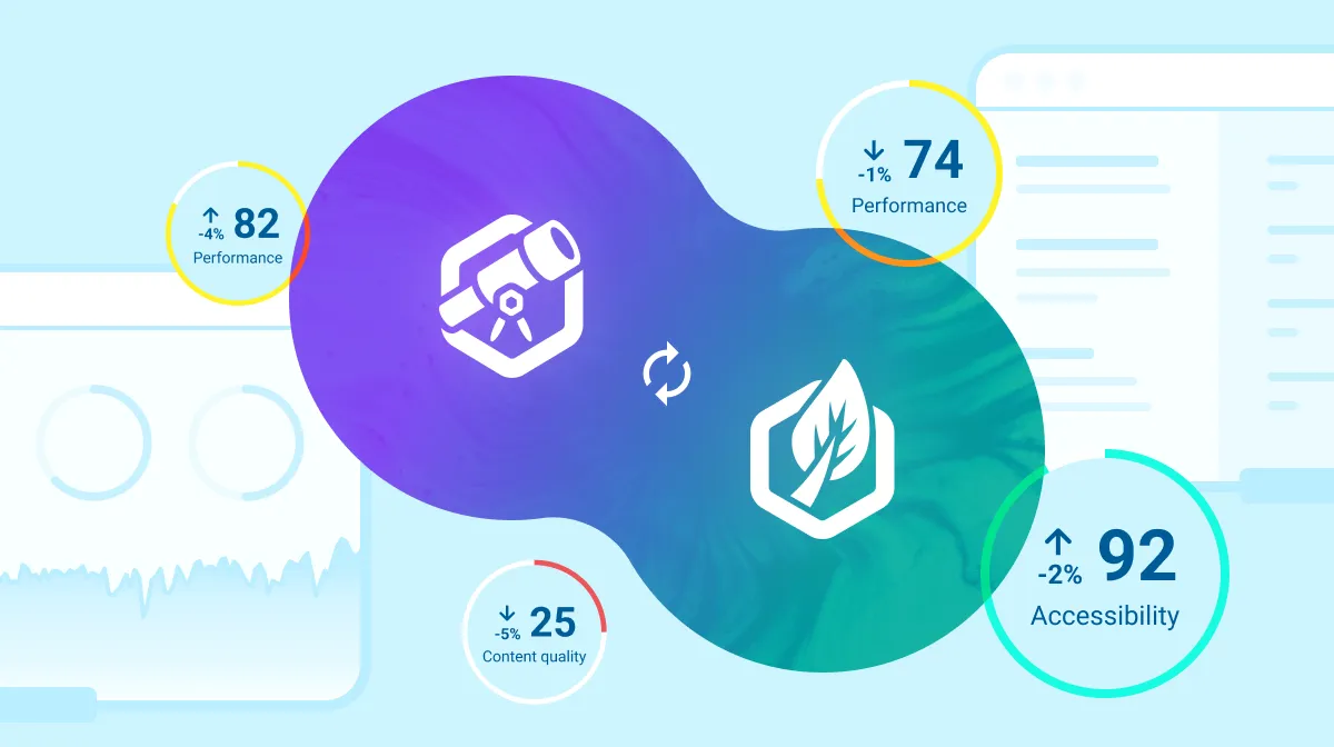
- Use Insytful to find inaccessible elements on your website
Using tools like Insytful can help spot areas for improvement on your website to improve accessibility. Automated site audits check your website weekly or monthly to help your website be inclusive and compliant.
Get a free accessibility health check
Check your website's accessibility score today with Insytful.